Power Lab podcast

UX and UI in Microsoft Power Apps: How to make an app shine

1 December 2021

Microsoft

The Microsoft Power Platform's low-code approach makes it possible for just about anyone to build an app, but how do you turn it into an intuitive and attractive end product? What do you need to consider when it comes to usability, design and branding? We would like to help you out with some basic principles.

Discover much more about this topic in our podcast

Would you rather listen to an amusing conversation instead of reading this blog post? Then we've got good news for you! This blog post is a recap of the second episode of our new podcast series, Power Lab Podcast. Two of our most entertaining experts explore the features of the platform each month and even manage to come up with new insights.


Lennert's experiment


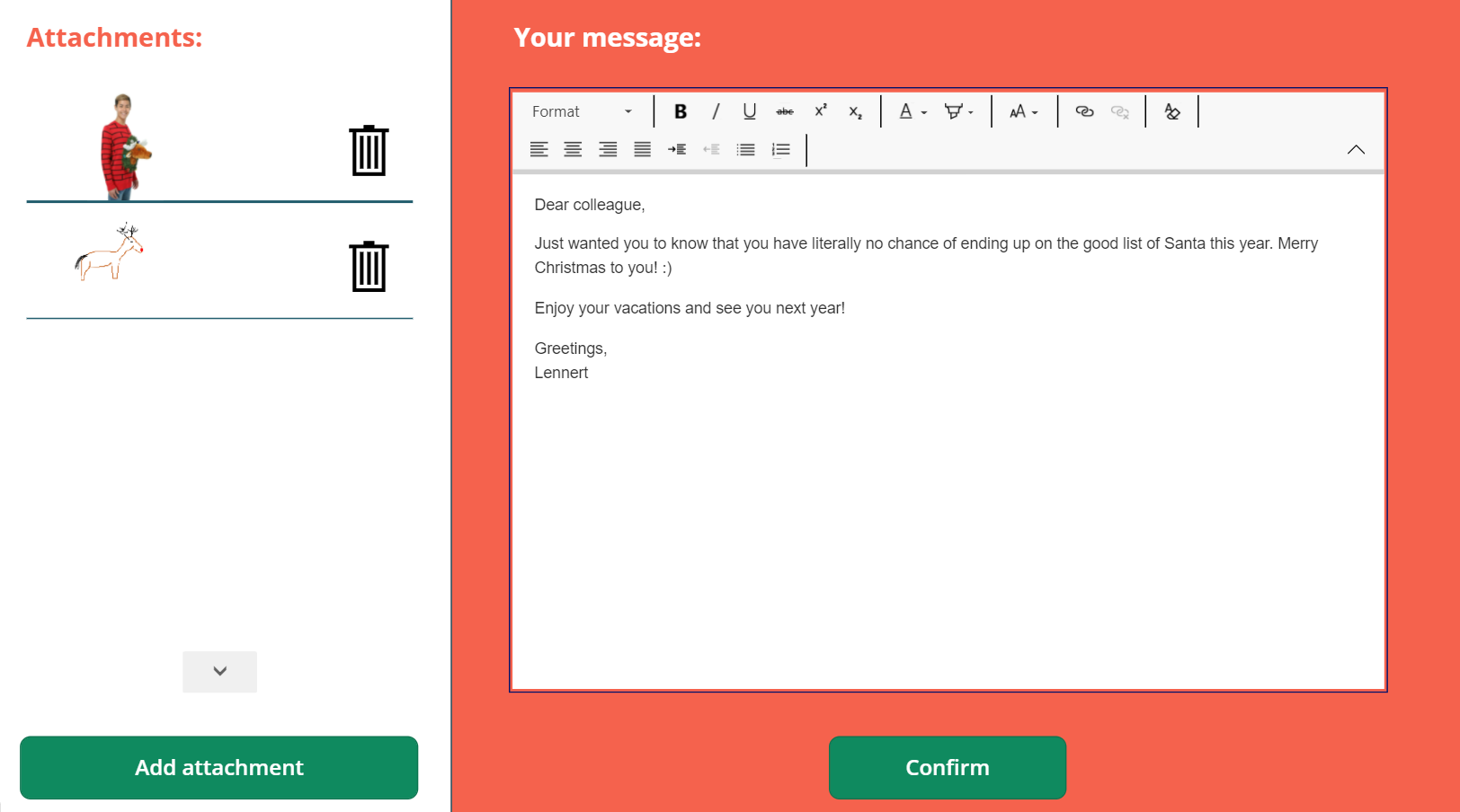
Every month Lennert, one of our podcast hosts, uses Power Platform to build another interesting application. This time, in anticipation of Christmas, he put together the Wishmas app in just a few hours. You can use the app to easily send a Christmas message, with an accompanying photo or drawing, to your most relevant contacts. From Graph API, the app uses Power Automate to request the contacts with whom you have recently interacted the most. This lets you instantly see who definitely deserves a Christmas wish and a picture of you in your geekiest Christmas sweater.


An app is only of value if it is actually used

To increase the chances of a successful app, it's best to go through a few steps before taking off. First and foremost, try to get a good grasp of the idea and the need for the app. Why should we build something instead of using an existing system, for example? Then start working on wireframes, which you show to the stakeholders so they are all on the same page from the start. Use PowerApps to visualize everything without the logic behind it, so you can show what the finished app will look like, with the right components, and move on to the real act of building and bringing the app to life. After this comes the testing phase. 80% of errors in UX can already be removed by having five people test and having them speak out loud what they are thinking and doing. What are they looking for? Why will they click on something? You can then use this valuable information to adjust the design.

It's on the inside and outside

Both UX and UI elements are woven into the above steps. User Experience (UX) represents how an app works and how a user experiences it. The User Interface (UI) is about how an app looks. A proper balance between both is important, as usability and beauty do not automatically go hand in hand. A beautiful app in which a user cannot find their way around will be left unused. A logical app that is unpleasant to look at is just as bad.

The best UI tips from our experts

  • Less is more. Stay away from too many colors and images. Create a style sheet in advance with the company colors and refer to it. Keep the background white and work with color accents.
  • Work with the predefined components such as headers. Make them right once on the style sheet and copy them from there to the appropriate screens.
  • If possible, go for a responsive app so that all components automatically adapt to the device used.
  • Keep limitations in mind, because there are some. Some bars have rounded corners and others do not; take this into account in your design.

The best UX tips from our experts

  • Always position elements in the most logical spot. For example, always keep the home button in the top-right corner so users don't have to search for it on every screen.
  • Focus on a happy flow. Find out what the best process is to achieve a certain goal.
  • Break down a long fill-in form into several screens. However, do provide a progress indicator each time.
  • Work with pop-ups instead of sending the user to a completely new screen each time.
  • Work with icons instead of text buttons. There are quite a few icons available in PowerApps. Just make sure that the meaning of the icon is commonly known.
  • Give various apps within the same organization the same look and feel so that the learning curve is easier to navigate.
  • Put as few actions as possible in the top-left corner of a mobile app, because that spot is the hardest to reach with your right thumb.

Get inspired about Microsoft Power Platform every month

Subscribe through your favorite podcast platform so you won't miss a single episode.

Discover all blogs
Read more

Subscribe and receive our blogs in your mailbox